REMS Prescriber Portal
Key Tasks
Experience architecture
UX & UI design
UI Kit creation
Custom icons & pictograms

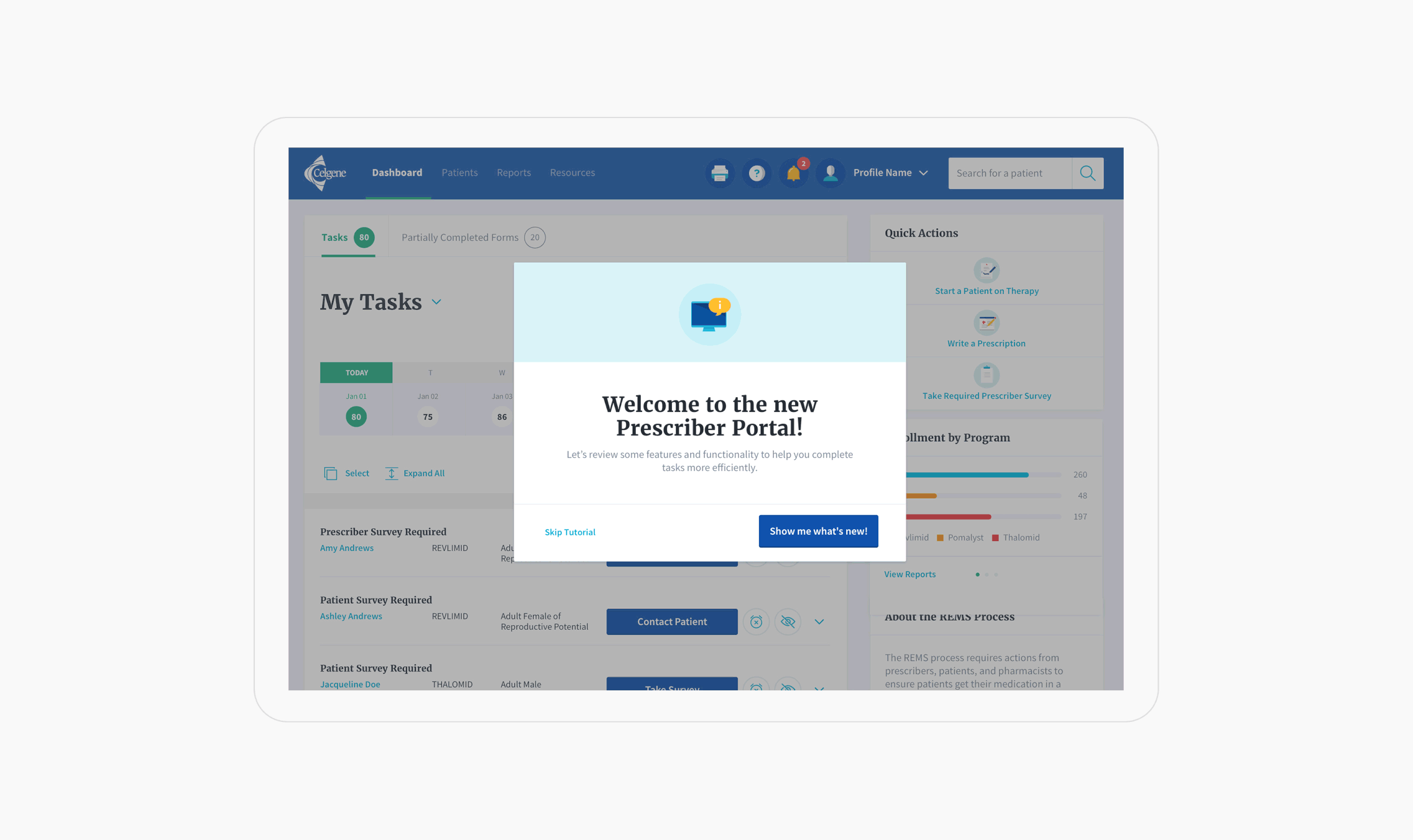
An intuitive web portal that accelerates prescriber tasks
Celgene (now Bristol-Meyers Squibb), a biopharmaceutical company, brought us in to redesign its Prescriber Portal, an online hub used by prescribers to complete FDA-mandated risk-mitigation tasks. The existing experience was both time-consuming and nonintuitive, and Celgene wished to improve the overall user experience.
Our challenge was to accelerate user-required tasks, while providing support and education for each step of the process.
A multi-disciplinary team
Our research department conducted user interviews, UX assessments and usability testing throughout the process.
Design deliverables were a site hierarchy diagram, detailed wireframes, and visual designs.
The portal was to be built using PEGA, a customer engagement software developer, so we met weekly with PEGA UX architects to ensure the feasibility of designs.

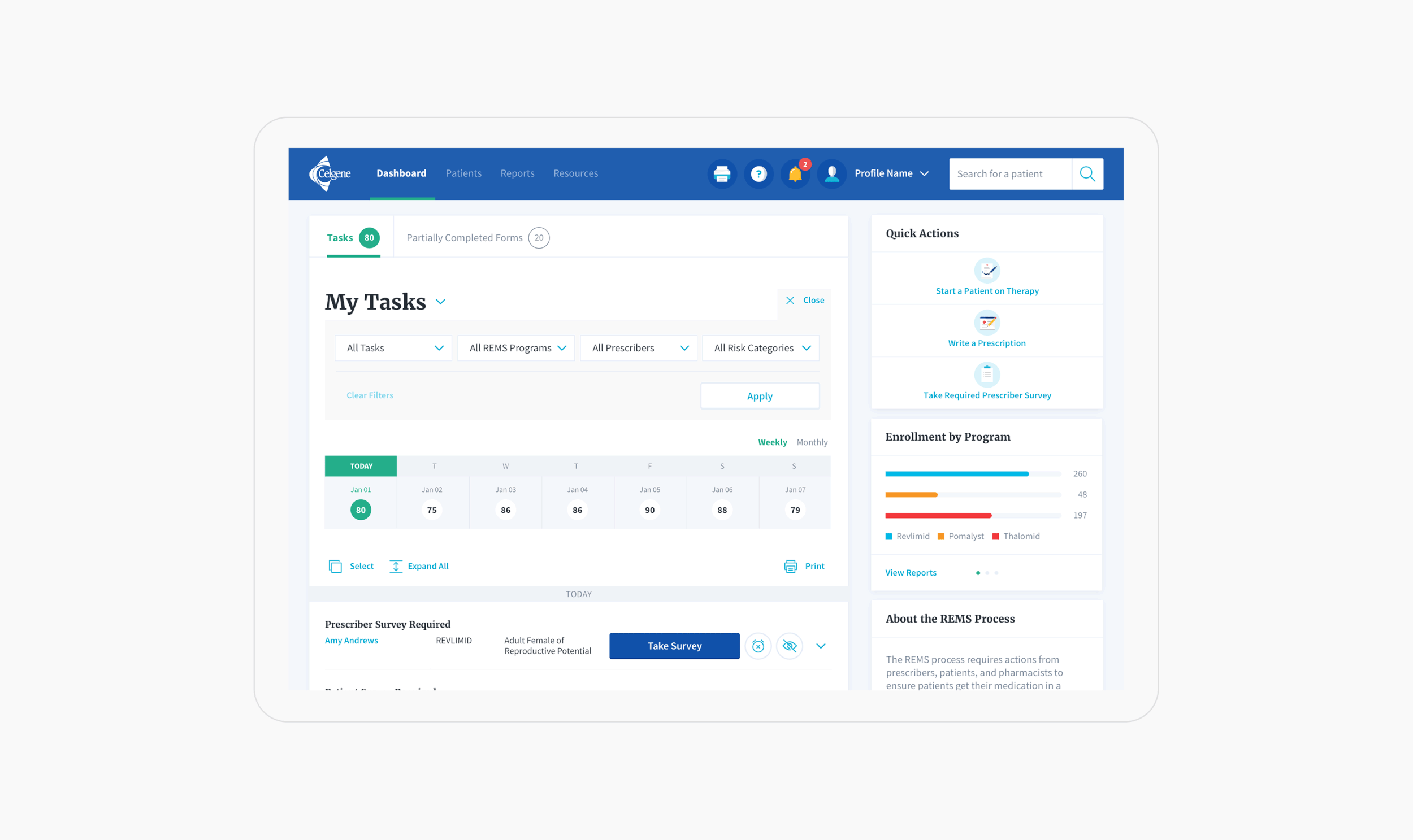
An actionable role-based dashboard
Users needed a homepage that allowed them to understand where to focus their time and jump to relevant actions.
Dashboard features included:
A task feed and “forward-looking” calendar
Filters that can be saved for frequently used views
Access to common actions, allowing users to quickly jump into key workflows
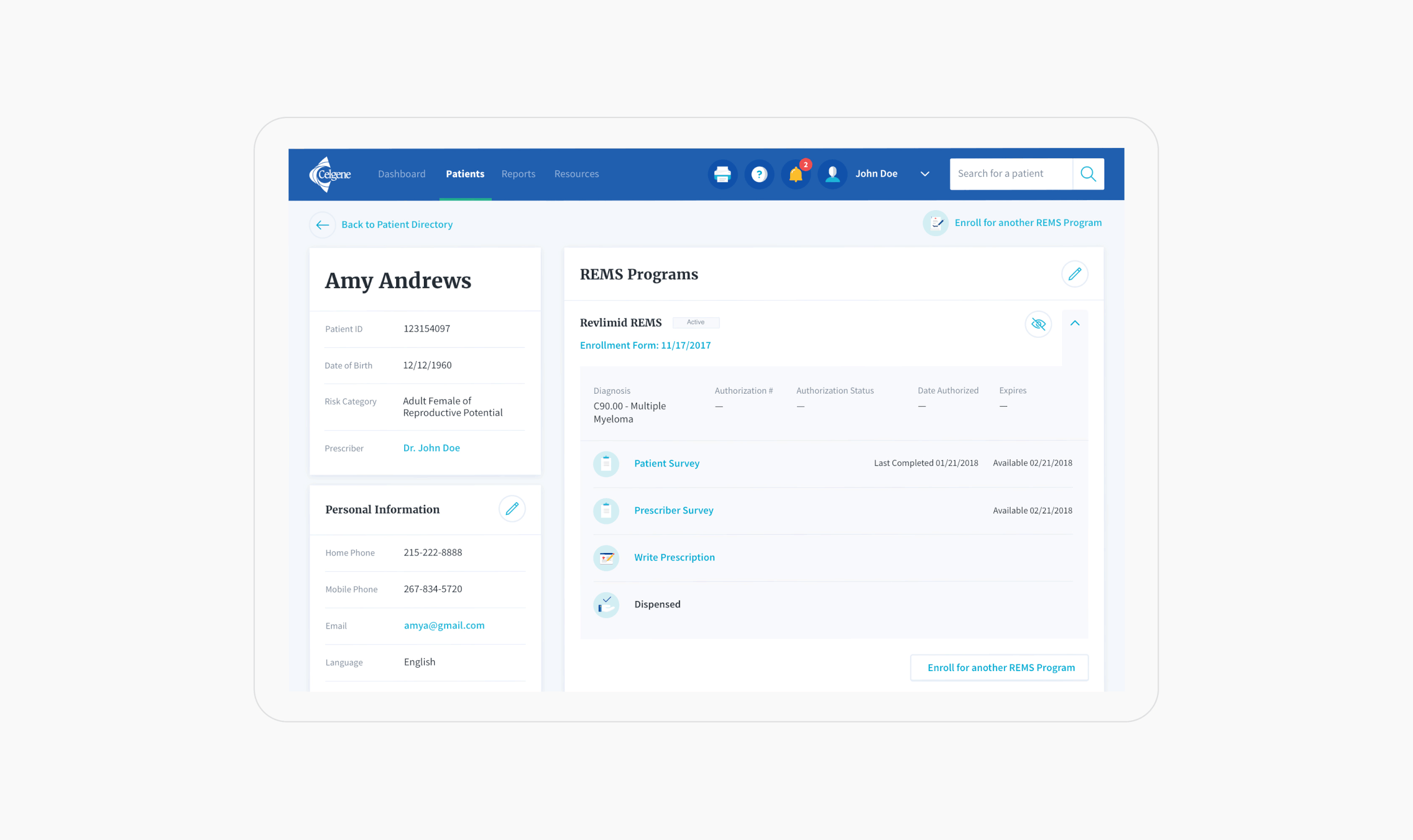
Clear statuses to track the REMS journey
REMS depends on several people and the completion of their respective tasks before medication may be dispensed. The patient detail page tracks each step. When problems arise, it alerts the prescriber and surfaces clear actions to resolve issues efficiently and ensure the patient’s schedule is uninterrupted.
Flexibility for individual patient needs
Patients may need to stop and start medication periodically; a snooze feature allows time-sensitive tasks to be delayed and allows for a seamless pause and continuation of treatment.
A new visual language
Evolving the brand for digital context
The previous web portal was visually outdated and clunky. The new look and feel was developed through a series of engagements, including the Patient Companion app. This evolution accumulated into a cohesive digital brand, and we delivered key page templates and a style guide along with visual mock-ups.
Custom iconography and pictograms
The new visual language includes an expressive icon and pictogram system. The pictograms highlight interaction points and help visualize the steps of the REMS journey, creating connections throughout the experience that were easy to recognize. These illustrations are accompanied by a family of line icons that represent utility functions.

The Result
The final design resulted in an experience that was far more streamlined and intuitive than the previous one. As development began in the US, this paved the way for the same transformational work for Celgene in the UK and Canada.
Next Project: